
 May 25, 2021

Your brand identity is one of the most visible and important ways to communicate your brand story. Your brand story reflects your purpose as a business and your brand identity is the first impression that you make on your target audience. A simple, clear and compelling brand identity will not only help you stand out from the crowd, but also convert that important first impression into a profitable and sustainable customer relationship.
Let’s review several examples of how companies, both large and small, have successfully crafted their brand identity to give customers a reason to care, a reason to listen, a reason to buy and a reason to stay:
Southwest Airlines
 Southwest has mastered their brand identity and they activate it with ruthless consistency. Not only have they managed to establish a highly differentiated identity in the travel industry, but they have also crafted a friendly corporate culture that is the envy of companies everywhere. This is all tied into the company’s purpose, culture and brand story. Perhaps the best manifestation of their purpose is the symbol they selected for their NYSE stock listing: LUV. The company goes out of its way to demonstrate that they care for their customers and employees, with the CEO going so far as to say they have never laid off a single employee. This is what the LUV ticker symbol communicates and Southwest lives up to this brand promise every day.
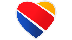
It’s important to note that Southwest keeps their brand identity grounded in just a few simple concepts. Their chosen logo is a rounded heart with three stripes of the company’s colors: red, blue, and yellow. Their planes are painted with the same colors and it makes them stand out among the sea of boring white Boeings. Overall, the name “Southwest” immediately conjures up an image and feeling, and this is the outcome your should be seeking as you set out to create a brand identity.
 PokerStars
The online poker giant PokerStars is another example of a company that has crafted a highly effective brand identity. Over the past two decades, they have managed to stay fresh with numerous branding and campaign efforts. For instance, the new campaign I’M IN captures the essence of the PokerStars brand as a central home for numerous types of entertainment. This demonstrates their ambitions to move away from just poker offerings.
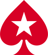
Their logo is a simple red spade with an embedded star – communicating that the player is the star. This simple identity technique is a powerful way of making the customer the hero. And when the player feels like a hero, they want to tell others about their experience and make the PokerStars brand story a part of their own personal story.
 By putting the spade between the words “Poker” and “Stars” in their trademark, they maintain a consistent look and feel across every player platform from desktops to tablets to smartphones. While this may not seem like much, it makes more sense when you realize the business is evolving to be an all-around entertainment giant, not just an online poker company. Furthermore, the marketing team at PokerStars are committed to periodically freshening the brand – giving their target audience a reason to care, a reason to play and most importantly a reason to come back and play again.
Starbucks
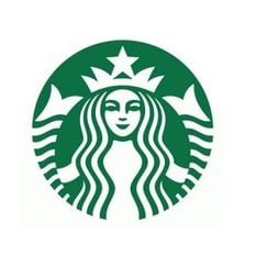 Starbucks is often cited as a best practice and held up by marketers as an outstanding example of creative brand identify development. While nothing about the name Starbucks or the iconic mermaid logo screams “coffee” they have still managed to build an enterprise that is known all over the world. Even people who don’t know the word “coffee” will know what the Starbucks brand identity represents.
The founders named the company “Starbucks” after the first mate in Herman Melville’s classic novel Moby Dick. The double-tailed mermaid appears to be a reference to an Italian medieval character Starbucks has claimed as “Norse” – but in any case, the imagery, born from a maritime book, inspired its founders to make her the logo of the Seattle coffee shop.
Today, the image of the mermaid is said to represent the tales of sailors and the tall stories they would share over a pint of ale, a shot of whiskey (or a hot cup of coffee!). This impactful identity acts like a “Siren’s call” – beckoning customers to make Starbucks their “third place” to relax and connect – after home and work.
College Hunks Hauling Junk
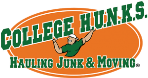 With this company brand identity, what you see is what you get. What’s great about the branding behind College Hunks Hauling Junk is that it’s incredibly simple. The name is descriptive. The logo supports the message of the name. And, crucially, it sticks in your head. When you’re driving past a truck, you probably don’t normally give it much thought. But if you drive past a truck with this orange and green logo emblazoned into its side, you remember it. Who will you call the next time you move?
College Hunks Hauling Junk is easy to remember. Partially because it rhymes, partially because it’s so easy to picture. The company trucks are brightly colored and have the logo on the side – making every sighting of a truck more free advertising.
McDonald’s
 McDonald’s has changed their branding countless times over the decades to appeal to the changing tastes of consumers. But the “golden arches” have been a constant throughout their brand evolution. While the arches will always be representative of hot food served fast, the company has realized that there are many other things that they can change around their brand identity to reach new consumers.
In their case, changing consumer opinion requires more than a new logo or a catchy slogan, it’s a complete overhaul that starts from the ground up. For example, they radically changed the interior of their restaurants to resemble a niche cafe, or a casual bakery/cafe chain like Panera Bread, hoping to attract more young professionals in this way.
McDonald’s also realized that coffee itself was a big selling point in this pursuit, and their old pots of coffee were no longer enough. “McCafe” was their next addition to the brand, and this has basically become a separate entity complete with its own logo, coffee cups, and wide selection of frozen and hot drinks. McDonald’s has done a fantastic job with their branding and other companies can learn many lessons from them.
The Takeaway
Keep in mind that you don’t need to have a Fortune 500 budget to create a winning brand identity. Earlier this month we outlined 4 simple steps to create a truly impactful brand identity for your business and keep you on track for success. Great brands, from Apple to Zappos, have a compelling story, a clear strategy and a ruthlessly consistent identity system that helps them connect authentically with their target audience. Your brand identity is your face – your first impression – so make the most of it. And remember, you only have six seconds to give people a reason to care, listen, engage, buy, and finally a reason to stay.
Thanks for reading. Sign up for our upcoming webinar event on storytelling, and then join our blog! You can learn more about how to harness the power of brand identity by following me on Twitter, connecting with me on LinkedIn, subscribing to the TopRight blog, and buying copies of my latest books, Strategic Analytics and Marketing, Interrupted.